2014 is off to a great start!

We’re thrilled to start 2014 off on a high note with an AMERICAN PACKAGING DESIGN AWARD
from Graphic Design USA. This competition celebrates well-designed packaging, of course, but also the power of design to advance the brand promise and forge an emotional connection with the
buyer at the moment of truth. With over 1,800 entires, House of Krauss is honored to have been recognized in this highly selective competition. Take a look at some of our award-winning work
on our website at houseofkrauss.com

Cheryl's_Elegant_Holiday_Gift_Packaging720px


Hugs, kisses and buttercream cookies!

From hand-decorated, heart-shaped cookies to inspired gift ideas, Cheryl’s treats are sure to delight everyone on your Valentine’s Day list. We are excited to have art directed and designed this latest catalog series and internet campaign for Cheryl’s Cookies & Brownies, part of the 1-800-Flowers Family of Brands. Share the love!Cheryls_VDay2014_Cover_JournalPost_720px


a journey to Authenticity

Meet Sharon. She had been in Marketing for nearly two decades, building the revenue streams for existing brands of established companies. But this was different. Now, it was personal – very personal. She had to create a brand for a new life coaching business as well as a platform for a personal memoir and self help book that essentially bared her soul in an effort to provide warmth to other women who were going through a fire. This is one of those situations that you need someone who can simultaneously separate themselves from the personal nature of creating a brand that bares your name, while tapping into what the audience needs in order to relate and trust. It helps if they can also leap tall buildings in a single bound…

“Lots of design firms can help you build a brand; House of Krauss brought to life the light that was inside me and my practice. They made it real and tangible, consistent and approachable. The team cared as much about this brand – and all its elements – as I did.  So, I dare say, it became personal for them too! ” – Sharon Pope

When you’re authentic, you’re true to yourself. When your brand is authentic, it is true to its mission and purpose. The power in authenticity, whether in your brand or person, is that it leaves no questions unanswered. People know where you stand, what you’re made of and what is important to you. Authenticity helps you define how others see you – and how you see yourself.

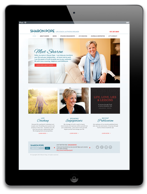
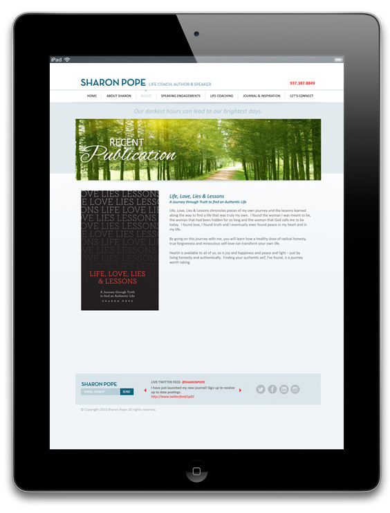
Take a look below to see Sharon’s new website and also the cover of her latest book. Our thanks
to our team members at Ciccarelli Photography, Demo 38 and fivesixteen.

SharonPope_Homepage_IPad SharonPope_Books_IPad


Made to share!

With irresistible flavors like “Big Time Butter,” “The Best Carmel Corn Ever,” “Pretty & Skinny”
and “Way Too Expensive White Truffle,” it’s easy to understand why Chicago loves Berco’s Popcorn. This premium popcorn is carefully hand-crafted in small batches with ingredients such as butter from Vermont Creamery and the world’s most expensive salt from the remote Danish Isle of Laeso. Food critics are eating it up!

“It’s the blockbuster snack of the season.” – www.UrbanDaddy.com

“Try to eat just one pop … you can’t stop. This new kernel company has our heart.”
– www.DailyCandy.com

We’re proud to have partnered with Berco’s Popcorn for their inaugural catalog.

BercoPopcorn_Cover_450pxBercoPopcorn_Signature6_450px


Help us choose!

We’ve been busy working on a new logo identity for Beth Seitz and our friends at
Cut.Color.Style. Below are some of the logo marks we have developed for our client.
Let us know which one you like best!

Located in the heart of historic Old Worthington, Cut.Color.Style. is a thoroughly modern,
full-service hair salon. The loft-style space is edgy yet relaxing, with a focus on providing
guests with the finest products, services, and most current techniques.
Cut.Color.Style_LogoOptions